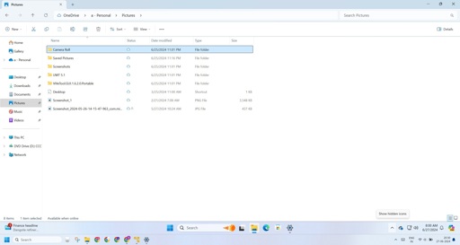
a feature to improve accessibility.
made necessary because there’s a lack of user options for picking ui colors like you used to be able to; and the ones microsoft uses for selected items are horrible, with very little contrast to distinguish them from background colors.
They’re fixing the problem they caused by taking away the classic ui theme. The borders used to be clearly demarcated just fine.
“I’ll take bullshit for $100”
See gray on gray scroll bars…
I actually prefer it because file explorer on windows servers is hard to see the edge of as I get older.
There does need to be some clear contrast for a window so you can visually identify where it is.
So if they could do this with non maximized “normal” windows that would be handy. But I get why they’re doing it with light background, light highlight color, etc.
Windows has “design standards”???
Regrettably it has multiple standards. There are leftovers from multiple versions of Windows UI throughout Windows 11.
Yep, “change anything the users like just the way it is”
this should be an option in the settings tbh some people may appreciate it


