They seem to have completely lost sight of the fact that a phone is a tool. I don’t want ‘springy’ animations when I tap a button, I want my tool to do what I intend. I don’t want notifications that ‘subtly’ stretch when I dismiss a different notification, I want the dismissed notification to go away and the others to close up around it.
What I do want is a phone that works securely, quickly, efficiently, doesn’t waste battery on nonsense, and doesn’t distract me from what I’m doing. I guess we get ‘pretty’ geegaws instead.
The UI goes in circles. I wish we stopped changing things when they aren’t broken.
Android 11 was peak design so far.
IMO.
Android 4.0’s aesthetic was peak design.
That’s called Holo. And yeah, it was nice.
sway and the CLI is peak design, imho
not amazing, but an improvement over the current design
Pretty meh
I got too optimistic when first heard the rumors. Nope, they’re still actively trying to build the ugliest design system possible.
spoiler

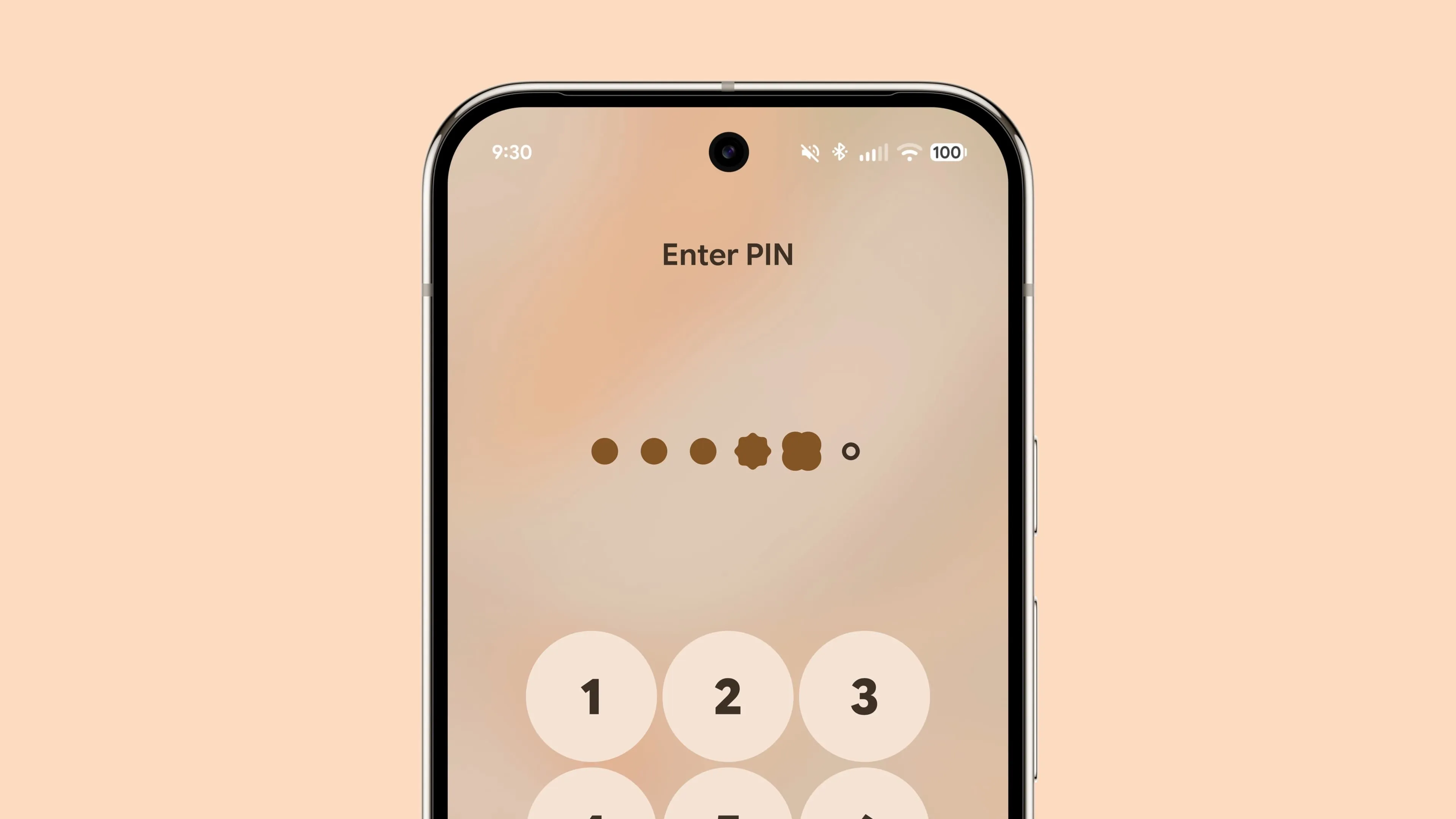
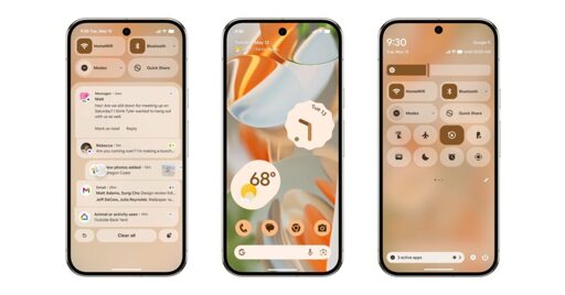
Why is the flashlight crossed out? Why do active buttons seem to have a different border radius? And what’s that circle icon that looks like a crosshair, location service? Whats wrong with the old icon? So many questionable design decisions and inconsistencies…
Your spoiler tag didn’t work for me.
Frankly I don’t see much difference from the current implementation.
The spoiler works in default lemmy ui, but I removed the angle brackets in case it throws off whatever you’re using.
And yeah, the general look is the same.
but I removed the angle brackets in case it throws off whatever you’re using.
Yep that did the trick!