I don’t know about all of you, I don’t like these new flat icons that everyone is using. What ever happened to the old icons, like on iPhone and Samsung they used to have them years ago. Those were good times. Now it is always these stupid boring cartoonish designed icons. Side note: Somebody please update this icon pack. I am trying to use it on xfce on arch but some of the icons aren’t working properly because it hasn’t been updated in a while. I’ll donate to you right away if you do it. Link to the repo: https://github.com/madmaxms/iconpack-obsidian
Quick info, the link does not work. You need to put it in the address part aswell (like this
[https://github.com/madmaxms/iconpack-obsidian](https://github.com/madmaxms/iconpack-obsidian)Here is a working one https://github.com/madmaxms/iconpack-obsidianI am a papirus man
My plasma 6 desktop has absolutely stunning icons, and im like you - I like proper icons that look more interesting.
Try plasma 6, I’m sure those icon sets are also much more complete. :)
This is the first time Ive ever seen those vowels together
If I understood it correctly, in this context it means that the icons normally retain the original logo and color scheme, while incorporating them into a single style.
a skeuomorph (from greek, “tool/container-shape”) is something that retains the characteristics of another thing that it is based on, even though those characteristics are no longer useful. think lamps shaped like candles, or the floppy disk save icon, or media player programs with volume knobs.
skeuomorphic UX is a good way to get users comfortable with a system by using designs they are already familiar with, and the original iphone used this to great effect.
This is a good example of skeuomorphic UI:
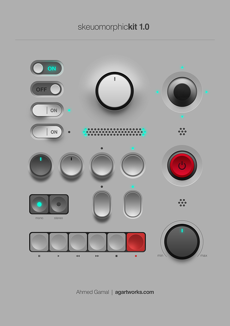
all to say, I’m not entirely sure these icons are skeuomorphs. they’re just glossy.
No. Old UI is terrible. The newest UI with extremely rounded corners is bad too but I’d much rather use it than old stuff.
Actually no, I hated the Vista era UI design. Linux themes were positively garish, add MacOS looked like a candy store. CDE greatly impressed me back then. It looked like it was made by adults for adults. Highly legible, and the pastel colors are being emulated by Solarized.
I’m sure that those UIs were a product of the times. The 90’s and noughties were loud and colorful and exciting and everything looked like a comic. Now that we live in more depressing times, we can look to the science of perceptual psychology.
You see, we have an attention budget, we need to process what we see. Visually complex UIs need to be parsed, and that takes mental effort, and that robs us of mental energy to focus on our work. It’s not a crippling effect, but it’s there.
Look at street signs and corporate logos, they easily lodge in our mind. Effective advertising has a clear and simple visual language, and this is what UIs should strive for.
It is by no means just you. I really hate how everything has to be so flat and shadow-less nowadays. I’m not at the point of shaking my fist at clouds yet or anything, but I really miss skeuomorphism in general!
i actually hate icons with like shading or 3d look. but I don’t really use icons anyway, the only icons i see are in my system tray and when i run wofi
I like how tidy it is. But I do prefer to be able to see icon shapes at a glance with my terrible eyesight as it helps identify.
Sometimes I think that I miss skeuomorphism, but then I realize it’s not the skeuomorphism that I miss, but my childhood and days when the world was much simpler.
Would I like to bring back skeuomorphic UIs? Yes.
I’m too old to be nostalgic for skeuomorphism. But a retina-burning amber monochrome monitor, text mode, with menus and UIs built out of ASCII graphics, or at best, 640 x 480 CPU-driven graphics modes? Now you’re talking.
From my perspective, the skeuomorphic era of the early-late 2000s is still “modern”.
Ya I feel you, I remember I had an iPod when I was a kid with the icons I think it was iOS 6. Now when I try to find skeuomorphic icon packs on Linux it is almost impossibile and the ones you do find are abandoned ☹️
Personally I don’t, I kinda hate old skeuomorphism 😅
Neo skeuomorphism has some neat novelty though.
Edit: this is just my personal aesthetic preference, I don’t begrudge anyone their love of skeuomorphism, or nostalgia for it.
I think I’m in the same place. I really like the idea of icons having depth. Modern icons are very versatile, but lack personality. Having some depth gives them some weight, but never really liked the emphasis on curves and gradients. I think a mix of original Material design and just a hint more depth would be the perfect sweet spot.
I’m curious how you feel about the GNOME application icons, they sound like they might be up your alley
Right now I generally have a preference for either weird stylized themed stuff I make myself, or very flat stuff like what android currently does for app icons, but I can certainly see the appeal of other stuff :)
I really like the application icons used in Gnome but I really like the consistent line weights and geometry of material symbolic icons so I’m still using a material icon pack on gnome
Edit: Here’s a picture I grabbed of icons done in the adwaita style Gnome uses in case you don’t use linux and aren’t familiar with them. Its not a full sampling, but you get the idea :)
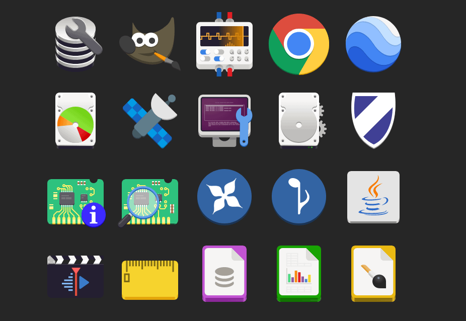
Take these icons, add one more layer of simple gradient shading: perfection
For example, GIMP’s icon looks especially bad here to me. If it had just a hint of black shading, it would look massively better (imho).
Interesting, thanks for sharing your perspective with me! ☺️
Any time! I’m a graphic nerd with none of the book learning, but I do work at a screen printing shop, so I have some intuitive understanding of logo/icon design, but don’t have the theory to go with it.
In other words, I have wildly subjective opinions that I’ll randomly dig my heels in on. (Sometimes when I have no idea what I’m talking about ha!)
Lol, I’m somewhat similar. I’m a big ui/ux nerd but don’t have professional or academic experience other than some pro-bono work in high-school. But I love tinkering with my phone’s homesceen and other similar little projects. I’m hoping to make a neocites page soon!
This is my previous phone’s homescreen I posted a while back:
https://mastodon.online/@CrisColor/111440259435482295
I’ve gotten a new phone since then and am still getting it updated to fit properly on a new screen, so right now it looks a little jank 😅 but it’s always interesting to hear how other people feel differently about aesthetics than yourself!
Right on. I’ve moved onto a dirty iPhone since, but here’s a screenshot of my super old Android setup back from when Material was new. After Android took out all the fun stuff custom ROMs could do, I sort of fell out of love with Android.
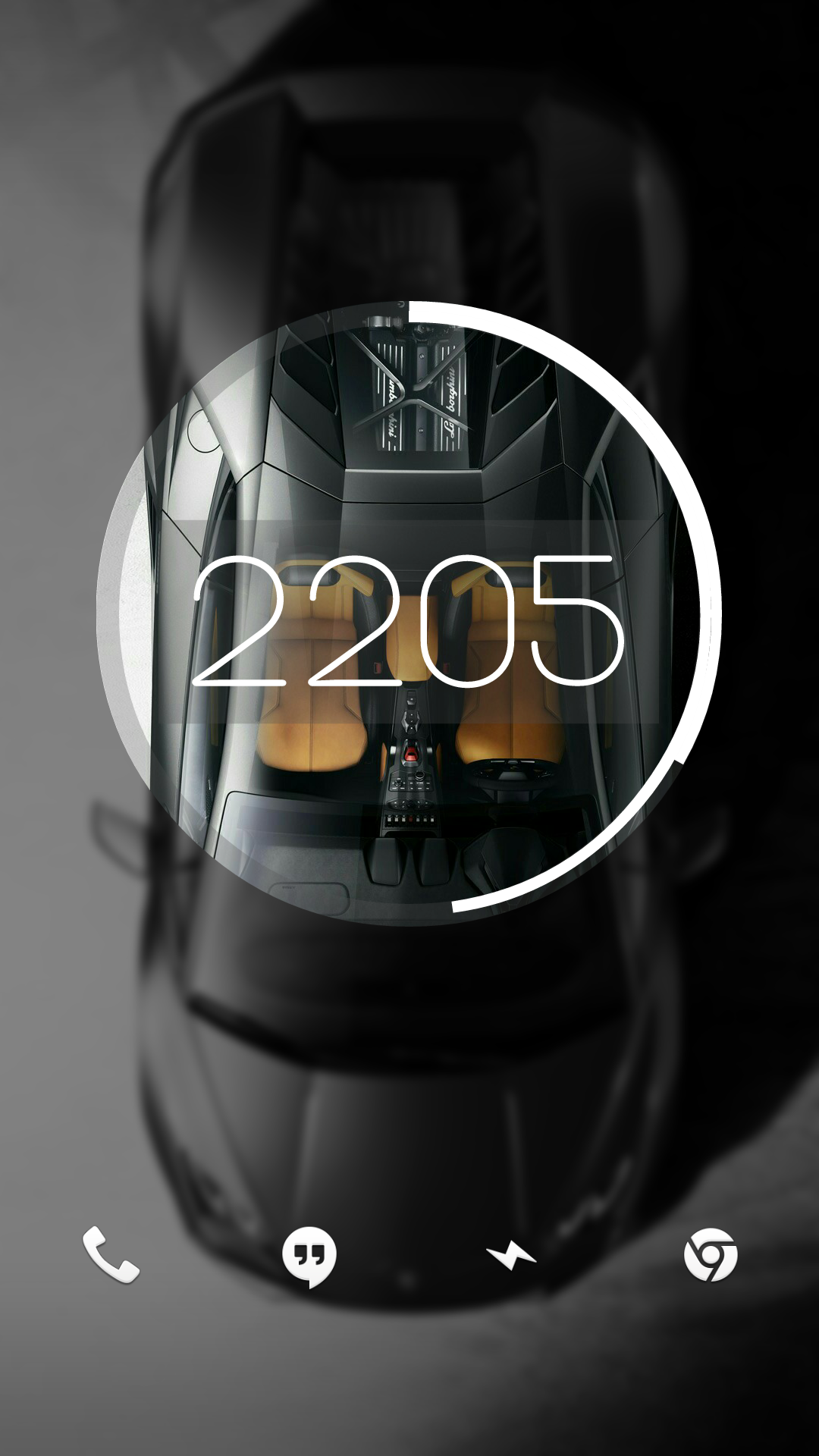
I had a cool feature at one point where it started out looking like this and unlocking it would make the circle expand and the background would show in full.
Man, I miss early KLWP
The thing I’m more nostalgic for was the time when everything had to be a glistening amorphous translucent blob, a bit like the Cingular Wireless logo or the MusicMatch Jukebox logo. And I’m in that era where you can just play MSN messenger sounds and you’ll get an OH MY GOD out of me.
Frutiger Aero, I think.
Sort of. What that page describes is in the same building as what I’m thinking about.
I’ve had the MSN message sound as my SMS Ringer for years now. The looks I get from people are fantastic.
I still have some screenshots from my old Android G1 that is skeuomorphism galore. It’s nostalgic.
What icon pack? (Is this post supposed to be a link?)
Edit: Ah. Now there’s an image.
deleted by creator
Absolutely not.


