

2·
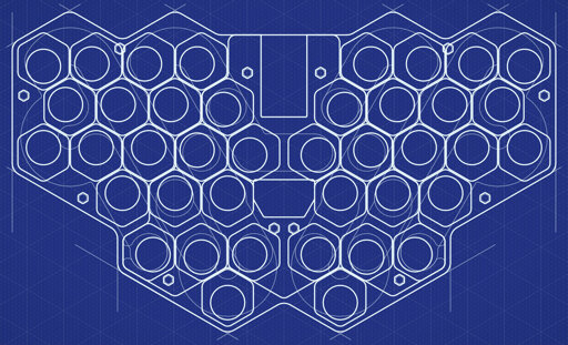
4 days agoI’m not currently planning a split version. But I do get the question enough that I may reconsider it in the future. That said, I feel the concept with an aggressive angle between keyboard halves resulting from a nearly unbroken hex grid, built-in tenting and keywells through stacked PCBs works best for a compact unibody design.


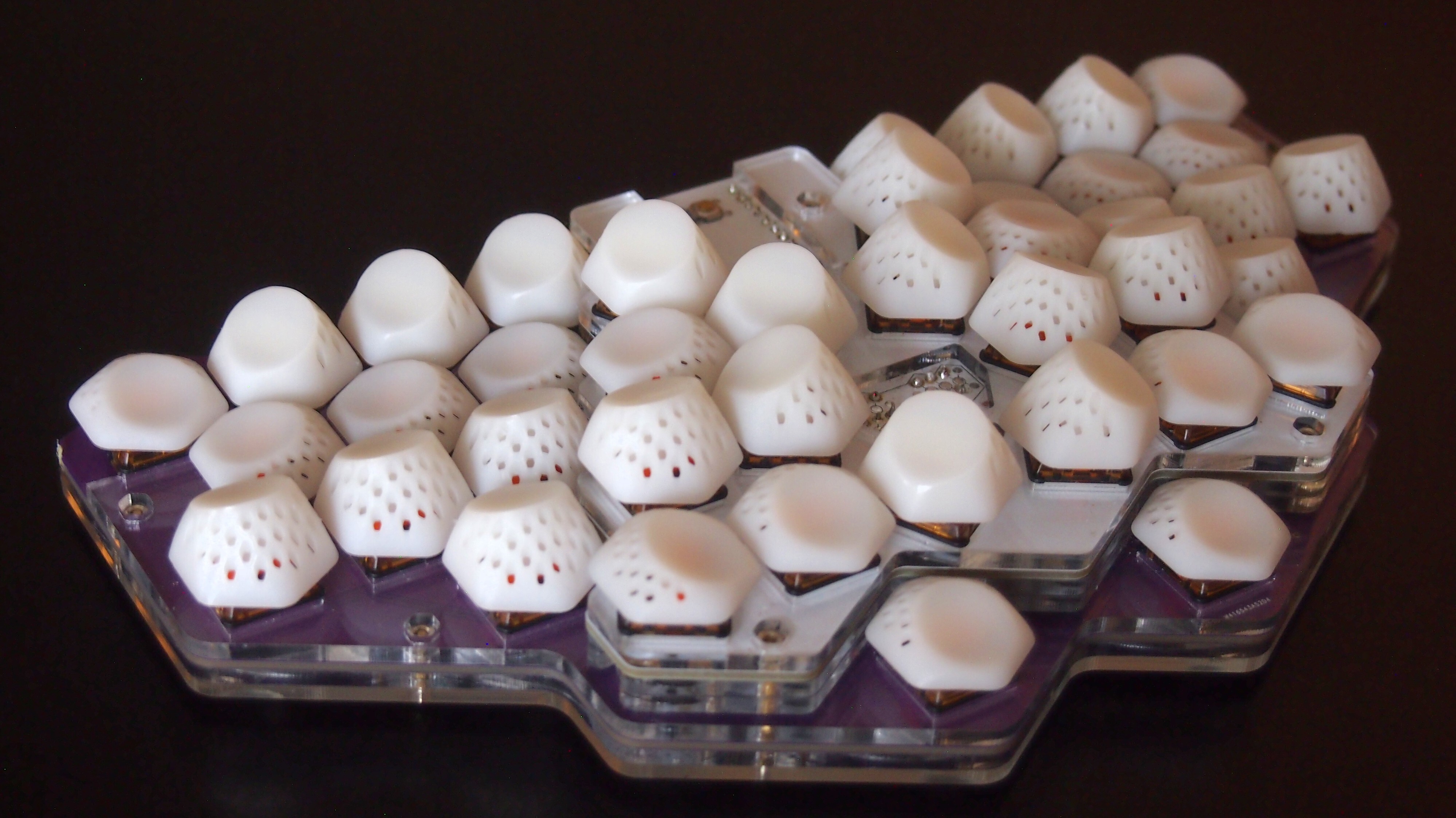
I used to get those comments a lot more on previous versions. I think the trypophabia effect is less pronounced with the new saddle dishes and without the holes I used to add for RGB to shine through. It does make the white resin keys look more like molars though. Not as much in person as in pictures, I think. Maybe a more matte surface would be better. Or just turn on the RGB.
That said, I am leaning into the insect aesthetic also with my company logo.