Aatube@kbin.melroy.org to Today I Learned@lemmy.world · 1 年前TIL the World Wide Web Consortium changed their logo on 1 Octoberwww.w3.orgexternal-linkmessage-square26linkfedilinkarrow-up1111arrow-down15file-text
arrow-up1106arrow-down1external-linkTIL the World Wide Web Consortium changed their logo on 1 Octoberwww.w3.orgAatube@kbin.melroy.org to Today I Learned@lemmy.world · 1 年前message-square26linkfedilinkfile-text
minus-squarenatecox@programming.devdeleted by creatorlinkfedilinkEnglisharrow-up12·edit-215 天前deleted by creator
minus-squareMouselemming@sh.itjust.workslinkfedilinkEnglisharrow-up6·1 年前I agree, though Nike would not
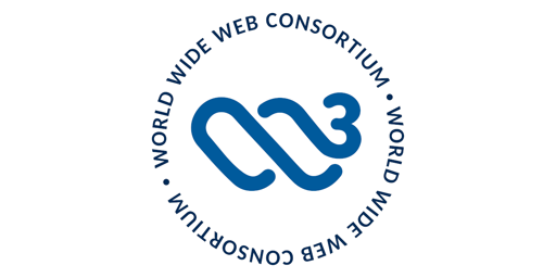
minus-squarecabbage@piefed.sociallinkfedilinkEnglisharrow-up4·1 年前I disagree that the new one is too abstract. The w³ part is pretty pronounced, and then there’s design elements that reminds me of surfing.
minus-squarenatecox@programming.devdeleted by creatorlinkfedilinkEnglisharrow-up1·edit-215 天前deleted by creator
minus-squarecabbage@piefed.sociallinkfedilinkEnglisharrow-up2·1 年前I guess human perception is very subjective. To me the W3 is very obvious, but I have a hard time seeing a penis.
minus-squareAatube@kbin.melroy.orgOPlinkfedilinkarrow-up2·1 年前i can definitely see the 3 and also have a hard time seeing a penis, but whether i’ll see the w depends on the time of day


deleted by creator
I agree, though Nike would not
I disagree that the new one is too abstract. The w³ part is pretty pronounced, and then there’s design elements that reminds me of surfing.
deleted by creator
I guess human perception is very subjective. To me the W3 is very obvious, but I have a hard time seeing a penis.
i can definitely see the 3 and also have a hard time seeing a penis, but whether i’ll see the w depends on the time of day