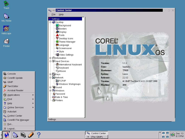
Anyone else remember Corel Linux?
I remember it and was there, on the KDE side of it. Summarized half-remembered version.
Corel WordPerfect had been ported to linux late in the 90s and they got this notion that people only bought Windows to use MS Office. So if they made their own OS, people would buy it just to use WordPerfect. They had grand plans to take KDE and linux and package it as a consumer grade OS. The closest other competitor doing that at the time was Caldera, and they were seeing some success, so why not eh?
They hired two people to “fix” KDE. But the people they hired had no idea how open source worked – how to interact with a community that functioned more like a meritocracy than a managed hierarchy. They showed up on the mailing list and tried to make demands – work on this, fix these bugs, adhere to our standards for this other thing, etc. When KDE didn’t jump to their whimsy, they sort of got annoyed and just decided to maintain a patchset or something.
The distro flopped hard. And it started with their management. They could have instead hired a half dozen KDE developers that were already contributing, started feature or bug bounty programs (like Google Summer of Code, which was great but came later), and possibly have pulled something amazing together.
Thanks, I didn’t know the whole story, I just piled it on the stack of failed-ish 90s OS attempts with OS2, BeOS, NeXT and probably a couple I’m forgetting.
That stirs a memory. I think this was the first time I tried Linux. Corel Linux came on the CD accompanying the German gaming magazine Gamestar. When I tried it out I couldn’t see the mouse cursor. The mouse worked, the cursor was just invisible. Thus ended my first foray into Linux.
Found it on archive.org: https://archive.org/details/gs-42000-b
Yes, the problem is that the main reason people used Linux was because it was Free Software.
So a proprietary Linux didn’t bring the usual benefits of Linux, it was just one more proprietary OS. And unlike BeOS or NeXT it didn’t bring much to the table compared to Windows or other Linux distributions.
Yes, the problem is that the main reason people used Linux was because it was Free Software.
Well, to be fair that was what the nerds using it at the time wanted. They weren’t Corel’s target consumer though.
Sure, but I don’t know what their value proposition for their customers was. Except “we want to take a piece of the cake from Microsoft”, which their customers didn’t care about.
Why would anyone use that instead of Windows?
I remember Corel Linux. It offered one of the nicest Linux desktop experiences at the time. If you wanted WordPerfect, it was also a great deal.
Leveraging your word processing market share to establish an OS presence is the opposite of what Microsoft did.
What is amazing about Corel these days is the museum of once market leading software that they still somehow sell. In addition to WordPerfect, who is using Quattro Pro ( spreadsheet ) or Paradox ( database ) these days? Who ever used their Presentation software?
For that matter, who is using CorelDRAW? It was right up there with PhotoShop at one point but you never hear about it anymore.
Like Nortel and Blackberry, it seems like Canada is able to grow massively successful tech companies but it just cannot hold on to them.
CorelDRAW is still in use. It’s vector graphics, it wasn’t competing with Photoshop. But there are also lots of good alternatives nowadays, which is why you hear less of it.
They’re talented in nostalgic acquisitions.
They got WinZip, ulead video studio, intervideo winDVD, Roxio toast, Pinnacle video editor, Bryce, Ventura Publisher.
Uh… In what way does BeOS have any similarities to Windows 9x? It resembles more like Next step if at all. The Author never took a look at it huh?
But no I’ve never heard of Corel Linux.
deleted by creator
Yeah I guess that’s my fault here that I lived through the 90s starting with windows 3.1. I saw Teleshopping praising and selling the illegal BeOS variant Zeta. But I always found it’s dockable windows very cool. Something that no other OS ever did, not even today.
Didn’t Fluxbox have dockable windows?
Does it? With Dockable Windows I mean the following: you have a file browser and a text editor and you snap them together so the titlebar acts as a tabbar and you can tab between the file browser and the text editor in the same window.
Yep, that’s Fluxbox tabs.
https://web.archive.org/web/20240202172611/http://fluxbox.org/features/
Tabbing is a nice feature that allows you to tab windows together. This can be combined with the “autogrouping” feature that is provided via the apps-file. This will make certain applications tab together by default.
Tabs can eiher be embedded into the window’s titlebar as shown in the upper screenshot or they can appear as little tabs at the outside of a window such as the lower example. The position and size of the outside-tabs is customizable.
That’s cool. Thanks for sharing!
Looks like win 95 IMO :-D
Looks like win 95 IMO :-D
- No Taskbar,
- Tasklist on the top right (also not in front),
- Dockable Windows,
- Package Manager,
- Bright Yellow half titlebars
How’s the atlantic anything like the pacific?
- smaller
- not in the same spot
- doesn’t get the same amount of sun
- different countries in it
- doesn’t help you go to the same places by boat
Truly nothing in common. Might as well be comparing an apple to caulking a window
Weak comparison…
BeOS/Haiku doesn’t LOOK even remotely like win9x.
It looks a lot like win95. I don’t think anything you brought up is relevant
It literally does not.
It has half yellow titlebars whereas win 95 has full titlebars with a solid blue colour (98+ had a gradient). The Tracker was in the top right corner and didn’t extend it’s height to the bottom. The Taskbar on the other hand was at the bottom corner and extended from left to right.
Those two differences are already enough to make BeOS NOT look anything alike windows 95.
https://upload.wikimedia.org/wikipedia/en/e/eb/Windows_95_at_first_run.png
It’s not the same colour! Clearly a completely different operating system!
You’re not wrong. KDE 1.x very much aimed at the Win95 market. They even directly targeted the windows userbase with jokes. The ordinal Win95 had a little fly-in animation that said “Where do you want to go today?” with an arrow pointing at the start menu. KDE 1.0 had this too, but it said “tomorrow” instead of “today”. Etc.
KDE also stole good ideas from wherever they were found. Trash is thus called because of Apple. The virtual desktops came from CDE. Etc. Sometimes it stole too much, and we would have discussions about flying too close to the sun, and tweak something so it would be just different enough not to raise the ire of lawyers.
Corel Linux was a KDE distro, so it largely had that familiar Win9x look, even if it felt different once you were actually using it. KDE later developed it’s own identity, but it retains its history and the baggage that comes with it.
Aside from “has windows”… How?
I used it for a good 2-3 years. More than anything, it was stable and reliable. Updates worked fine and it handled all my hardware, which I’d run into problems with on other Linuxes. No complaints, though migrating versions was a WTF, because there was no clear path with CLOS, so wound up learning Debian and their Toy Story-based version naming convention.
I remember Corel Linux as a great disto. I used it for a while and found it very beginner friendly, polished, and it looked like it could one day become what Ubuntu eventually did.
Unfortunately, Corel saw no revenue would ever come from it, so it was sadly dropped.
I remember it being painfully slow on my hardware which was pretty good at the time.
I didn’t use Corel Linux, but my first distro was its first (and I think only) descendant, XanderOS
Are you sure it wasn’t Xandros OS?
No, just Xandros, the e was a typo on my part, and the OS wasn’t capitalized but stylized a different color than the rest of the name
It’s long dead by now
Hey my first Linux distribution.
Looks like the novell(?) frontend to windows
I still have the inflatable penguin that came in the box
That nose-job is so, coral.
I remembering it being bundled for free on a CD with a computer magazine
Ok, KDE looks most like Windows 10 to the best of my knowledge, what looks most like Windows 11?
Windows 11, in terms of design changes, seems to draw inspiration from KDE and Gnome.
The Win11 start menu changed and looks more like the KDE Plasma one, albeit centred like the Gnome app grid.
They’ve switched to rounded corners, like Gnome.
They now use dots to denote pages, like Gnome does all throughout their system.
To me, the overall system in Win11 seems like it’s been made more like KDE, but the smaller nuances seem more Gnome-inspired.
Microsoft is no stranger to copying Linux DEs, remember KDE Plasma’s motto in 2017? “Simple by default. Powerful when needed.”
Compare that to Microsoft’s totally not stolen tagline they used to promote 11: “Simple by default. Powerful by choice.”
Lol, I use GNOME daily, and I didn’t notice the inspiration until now. I think Windows 11 uses a lot more transparency and blur than KDE or GNOME.
deleted by creator
You can add more transparency in KDE. Just not sure it’s that needed - I find Windows 11s level of transparency a bit distracting.
KDE can look like pretty much anything. The default layout is generally Windows like with a lower panel with a menu and task bar to the left and a system tray to the right.
Windows 11s big “innovation” is centring the task bar and start menu. In the latest version of windows 11 you can finally move it back to the left. KDE can already centre both or move to the left and much more. There are also windows 11 global themes in the KDE library, I’ve not tried them though.
Windows 11 is otherwise not that different from windows 10. KDE already has all the graphical bells and whistles, and has long had a unified settings menu, and has way more flexibility for changing up the layout (it can be Mac like or old gnome like, or gnome 3 like or custom).
A lot of the gnome 2 based WMs are also very flexible - xfce, cinnamon, etc. I’ve never used Gnome 3 - I assume it’s similar?
The only GNOME 2 desktop environment is MATE.
MATE is a continuation of the GNOME 2 code after GNOME 3 came out. It literally IS GNOME 2 just with a different name.
Cinnamon was also a reaction to GNOME 3 but it is an alternative desktop for GNOME 3 ( and newer ). It is mostly modern GNOME. It was never based on GNOME 2.
The only thing XFCE has in common with GNOME is that they both use GTK. XFCE was originally based on XForms ( the XF in XFCE ). It certainly has nothing to do with GNOME 2.
Xfce isn’t based on GNOME at all and Cinnamon is based on modern GNOME, not GNOME 2. Mate is based on GNOME 2, tho. All of them are very different from modern GNOME, tho.
This is a 10 minute effort but I think you can push this even further to make it look like Windows 11 on KDE

Wow, that’s really cool, what did you do?
I installed OnzeMenu and EventCalendar via the settings > add widgets. The Windows 11 theme and Icon on Settings > appearance.
If you right click the KDE menu icon from the taskbar, there is an option show alternatives, pick OnzeMenu from that. Same case goes to the time/date.
deleted by creator
It’s a default wallpaper on KDE. The name is Safe Landing but to save you the hassle, here you go

deleted by creator


